Guidelines
The Logo
Clear Space
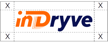
We want to keep our logo clear and eye-catching by giving it breathing room. Avoid blocking it with graphics, text, or anything else that muddles its identity.
Surround the logo on all sides with a “clear zone” indicated by “X”. This space scales with the logo size, always ensuring clean visibility.
Minimum Size
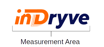
Stick to a minimum length of 50px (0.7in). Smaller than that, and it’s off-limits. Ideally, use it at 75px (1.0in) or bigger for maximum impact.
Color Usage
Against dark backgrounds, invert the logo for a clear view. On light backgrounds, stick with the normal version.

Logo Colors
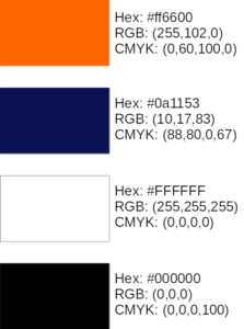
Nail the Indryve look with the right colors.
Ideally: Use Pantone for precision.
No Pantone? CMYK works too.
Digital? Grab the RGB code.
Remember: Colors might differ, so keep the official Pantone as your guide.
Respect the Logo: Keep it Untouched and Clear
Our logo tells our story. Keep it pure and visible wherever it goes. Don’t mess with it—no changing colors, stretching its shape, or hiding it in clutter. Let it shine!
Monochrome Logo
Can’t use the full-color logo? No problem. Switch to the monochrome version.
